Solving Black Box Puzzle 31 with data analysis
James Lyndsay has created a number of amazing Black Box Puzzles: tiny applications that challenge you to figure out what they do. (You can support him in creating more of these at his Patreon page.) Two of these Puzzles, 29 and 31, not only have a GUI to explore, but also an API.
And that gave me an idea. If you explore these Puzzles through their GUI, you start from the inputs. You try out different inputs in the hope of discovering a pattern in the outputs. And then that pattern feeds back into your exploration.
With an API, however - and because of the nature of Puzzle 31 - it becomes easy to get the outputs for all possible combinations of inputs. Which means you can start your exploration from the outputs instead of the inputs.
Before I tell you how and what I did, three important remarks.
First of all, I will be spoiling the solution to the Puzzle in this blog post. So this is the right moment to go and solve Puzzle 31 for yourself first. Or at least go play a bit with it, so you have an idea what the inputs and outputs are.
Secondly, I had already solved the Puzzle through the GUI a few months ago. So it was more of a “Can I find the solution this way as well?” than a “Can I find the solution?” thing.
Finally, the code and the spreadsheet I created (linked throughout, also available on GitHub here), are not very clean. I thought about tidying them up, but my two reasons for not doing so are (1) laziness; (2) the way they are now gives a more honest picture of what I did.
Getting all the combinations for Puzzle 31
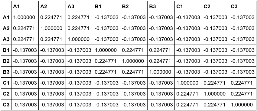
The API of Puzzle 31 is described here. You can actually use it from your browser by adding the query parameters for all the buttons like this: http://blackboxpuzzles.workroomprds.com:8002/puzzle31?buttonA1=up&buttonA2=up&buttonA3=up&buttonB1=up&buttonB2=up&buttonB3=up&buttonC1=up&buttonC2=up&buttonC3=up, which will return {"lamp1":"on","lamp2":"off","lamp3":"off","lamp4":"off"}.
With that figured out, the next question was how to iterate over all the possible inputs in the API requests. Turns out that the Python library itertools has a product() function, which does exactly that: product(('up', 'down'), repeat=9).
Sending API requests with Python is something I have done before (yay requests library!). The same for writing data to a csv file. So I ended up writing this Python script, which got me this csv file.
In hindsight I would make one change to the script. The values “down”/”up” and “on”/”off” make data analysis harder than it should be. So later on I created a different csv file replacing down”/”up” and “on”/”off” with 0/1.
Data analysis with a spreadsheet
Before trying to tackle the analysis with Python (see the next section), I went at it with a spreadsheet. I have done some data analysis and manipulation with spreadsheets in the past, so I figured that with some filters, some formulas, some conditional formatting, and perhaps a pivot table, I should be able to solve the Puzzle.
You can find that spreadsheet here. Normally I would use Excel, but I got curious if I could get it done with LibreOffice Calc instead. Turns out that yes.
Solving lamp 1
First thing I did was checking how many input combinations would turn each of the lamps on/off. For lamp 1 there are only 2 combinations that turn it on. For all other 510 combinations, it is off. Lamp 2 is on for 337 combinations, off for 175. And lamp 3 and 4 have the same ratio: 169 combinations for on and 343 combinations for off.
These results suggest that although we have four lamps, there might be just three types of behavior. Or just three behaviors. So I checked if lamp 3 and 4 do the same thing, but that’s not the case. For 91 input combinations both are on, for 2 x 78 one is off and the other on, for 265 combinations both are off.
Ok, back to lamp 1, because with just 2 input combinations that switch it on, it should be easy to look at those two combinations and figure out how it works.

And there it is: lamp 1 switches on when all buttons are either up or when all of them are down. So that’s lamp 1 solved.
Solving lamp 3 and 4
With lamps 2, 3 and 4 having so many combinations resulting in the lamps being either on or off, I added a column to the spreadsheet counting the number of “down” buttons for each input combination. This told me that switching lamp 2 requires at least two “down” buttons. Switching on lamp 3 or 4 required at least 3 “down” buttons. (So lamp 3 and 4 are still very similar.)
Another thing I did was adding conditional formatting similar to the GUI of the puzzle. “Down” buttons turn blue and “on” lights turn red. This made it a lot easier for me to spot patterns while looking at the data.
I decided to look further into lamp 3 and lamp 4 first. Looking at the input combinations with the minimal number of three “down” buttons that switch the lamps on, shows a clear pattern:
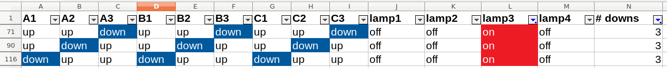
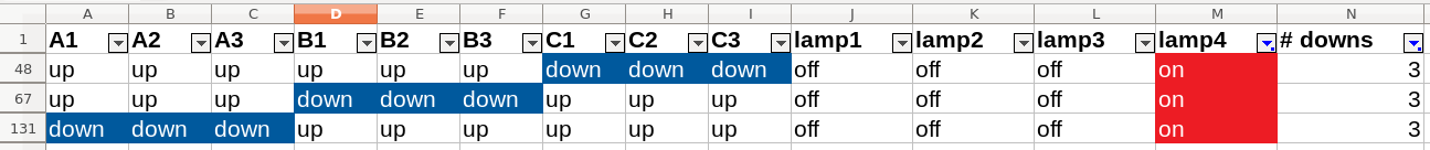
Lamp 3 switches on if three buttons with the same number are down; lamp 4 if three buttons with the same letter are down.
Of course, the question remains if that’s all there is to lamps 3 and 4. I did a quick visual spot check for lamp 4 with more than three buttons in the down state. That was more of a formality, though, since I knew from solving the Puzzle through the GUI, that I had the correct solution.
What I should have done however, was add a formula to the spreadsheet calculating the state of lamps 1, 3 and 4 based on the inputs. Then add another formula comparing those states to the actual states and check if I got al off them correctly. So I added these for lamp 4 in the spreadsheet in sheet “puzzle31_binary”.
Solving lamp 2
Taking a similar approach as with lamp 3 and 4, I looked at all input combinations with only 2 “down” buttons that switched lamp 2 on. That suggested a pattern related to the middle buttons of the outer rows and columns. However that pattern didn’t seem to hold up when also looking at the inputs with 3 “down” buttons. So I needed something more.
I decided to turn to pivot tables (pun intended). That didn’t gain me anything, though. I have only very rarely used pivot tables in Excel and now in LibreOffice Calc I failed to make a pivot table do anything useful. Back to using filters to make sense of lamp 2.
To make that a little easier, I copied all inputs that result in lamp 2 switching on to a new sheet. Filtering the input combinations on 2 or 3 “down” buttons and counting how often each button was “down”, showed a pattern. The count would be either 5, 6 or 15. And only the ones with count 15 play a role in the combinations with 2 “down” buttons. So I filter further, keeping only the combinations in which the inputs with count 15 are “up”. And I am left with two input combinations: A1-B2-C3 and A3-B2-C1.
On a hunch I decided to go back to the first filter result, while filtering out the two input combinations I just found. (Hence the “man filter” column in the sheet.) Looking at the counts, that leaves me with only two groups of inputs: the one with a count of 4 and with a count of 15. So it seems that hunch was a good one.
Then I look at all the input combinations in which button A2 is “down”. If there are only two “down” buttons, these are either B1 or B3. And when there are three, either B1 or B3 are “down” as well.
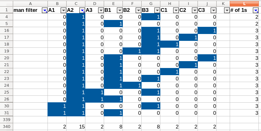
Performing the same steps with B1, shows the same pattern, but with A2 and C2. Which means there are two types of input that switch lamp 2 on: (1) inputs of the pattern A2-B1|B3, and (2) inputs of the pattern A1-B2-C3.
And that solves lamp 2: where lamp 3 and 4 are about the straight lines, lamp 2 covers the diagonals.
Data analysis with pandas and seaborn
For the data analysis in Python I created a Jupyter notebook - been wanting to look into these - which you can find here (rendered very nicely by GitHub, btw). For analysis I used the pandas library, for visualization seaborn.
Visualizing a single input combination
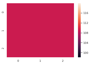
After using pandas’ dataframes to replicate some of the steps with the spreadsheet, I decided to “mis-use” seaborn’s heatmap to visualize the two input combinations in which lamp 1 is on. That allowed me to figure out how to create a heatmap, and how it would be displayed in the notebook.

Lamp state heatmap - attempt 1
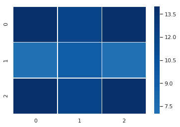
Now that I had an idea of how to create heatmaps, I decided to create one of all the input combinations that result in lamp 3 switching on.
Obviously that didn’t do me any good. To be honest, I couldn’t quite believe my eyes, so I verified the result using the spreadsheet. It checked out. Thinking about it I realized that the input combinations could be sorted into three groups. And each group could be defined as: three buttons with the same number that are “down”, combined with all possible combinations for the other buttons. So basically all the noise drowns out any signal.
Lamp state heatmap - attempt 2
I realized I had to filter the data in some way, so I decided to reduce the dataset to input combinations that resulted in only one of the lamps being switched on.
You could say that the lamp 2 heatmap suggests a diagonal pattern, lamp 3 a vertical one, and lamp 4 a horizontal pattern. However, it’s not really clear cut. If I hadn’t known the solution, I’m not sure what I would have concluded from these heatmaps.
lamp state heatmap - interlude
By now I had figured out I needed to find a way to analyse the correlation between different inputs - instead of throwing all inputs and outputs on one big pile.
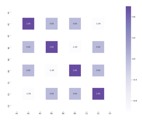
After some googling I found that I could use pandas’ size() on the result of a DataFrame.groupby() to get more insight into these correlations. As you can see below, if I group by A1-A2-A3, I can see how often each unique combination of values of A1-A2-A3, occur in a dataset.
So I took the dataset that only switches lamp 4 on and grouped by A1-A2-A3, A1-B1-C1 and A1-B2-C3. The first two you can see below. The third one you can find in the notebook; it’s very similar to the second one.
A1  A2  A3                 A1  B1  C1
0   0   0     6            0   0   1     5
        1     2                1   0     3
    1   0     1                    1     2
        1     1            1   0   0     5
1   0   0     2                    1     7
        1     2                1   0     2
    1   0     1
        1     9
I noticed two things. Firstly, the A1-A2-A3 result seems to adhere to some logic, while the A1-B1-C1 looks more random. Secondly, the A1-A2-A3 grouping contains input combinations in which all three buttons are “down” or “up”. The other grouping does not.
lamp state heatmap - correlation
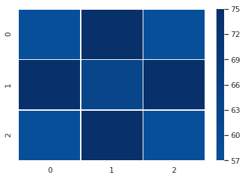
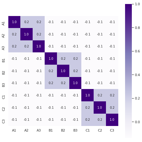
Feeling I was on the right track, I started browsing the pandas documentation and there I found the solution: the DataFrame.corr() method. It does exactly what I need it to do. You feed it all the input combinations that result in for example lamp 4 switching on and it calculates the correlation between the inputs.
The result is a table, where a positive number indicates a positive linear correlation (highest is 1), zero indicates no correlation, and a negative number indicates a negative linear correlation (lowest is -1). Since we are looking for a positive correlation (buttons being either up or down together resulting in lamp 4 switching on), this table allows us to solve lamp 4. Anything with a positive number is part of the pattern for lamp 4.
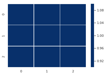
And the pattern is even clearer in a heatmap:
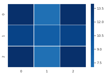
Since I was curious, I did the same for the dataset of input combinations in which only lamp 4 and none of the others are switched on. Interestingly, although the pattern is still visible, it is less clear. We need the full dataset with what I previously called “noise” to properly calculate the correlations.
Now let’s look at the other three heatmaps. The one for lamp 3 shows a clear pattern similar to lamp 4.
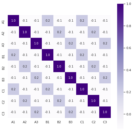
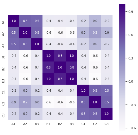
The correlation heatmap of lamp 1 shows a clear pattern, although it does look a bit weird because of the logic behind its behavior: all buttons either up or down.
Finally, the heatmap of lamp 2 does show a clear enough pattern (focus on the positive versus negative numbers), but it doesn’t jump out as much as with lamps 3 or 4.
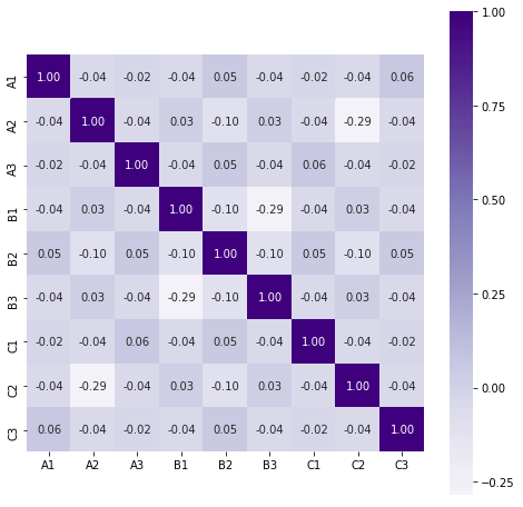
I can think of two reasons for the pattern not to jump out as clearly. First of all, there are two patterns in the data: diagonals of two “down” buttons and diagonals of three “down” buttons. Add to that all the different states the rest of the buttons can be in and you get a lot of noise. Secondly, some of the correlations of the two “down” buttons pattern cancel each other out. You can see that in this heatmap showing the correlation between input combinations with max two “down” buttons switching lamp 2 on:
I don’t think this heatmap is a really valid way of using correlation coefficients because of the limited dataset, but it still tells us something about the behavior of lamp 2.
And that wraps that up: Puzzle 31 solved with Python data analysis.
Closing thoughts
Since I wasn’t familiar with all the tools I was using, solving the Puzzle this way took a long time - literally hours. I’d be faster next time, of course, but finding the solution through exploring the GUI can be done in 5-10 minutes.
I had a lot of fun trying to figure out how to get these tools to do what I wanted. So a big thank you to all the great people who built these tools.
I still have a lot to learn on how to do data analysis well. For instance, when seeing the positive numbers in the correlation tables, I was like: “Puzzle solved!” It was only when writing this blog post, I dove a little deeper into what those numbers actually mean.
Do not underestimate the power of spreadsheets. As Felienne Hermans says in her talk “How to teach programming and other things?” (great talk, go watch when you’re done here) at 5:25:
Excel is an amazing programming language that empowers ‘normal people’ to do programming in a variety of different domains in finance. And this became the motto of my PhD dissertation: “Spreadsheets are code.” Spreadsheets are a valid means of programming.
In that light it was interesting to notice how a Jupyter notebook is basically a spreadsheet on steroids.
Something that wasn’t as fun as I had hoped, was solving the Puzzle with Python. I didn’t have the expected eureka-feeling when I saw how the correlation heatmaps provided the solution. Ok, it was the end of a tiring day and I knew the solution beforehand, but still.
Writing this blog post made me realize how my decisions while doing the data analysis were informed by me already knowing the solution. To give one very basic example: I knew that putting buttons in their “down” state made the lamps switch on. So from the start the focus of my data analysis was: “What input combinations make the lights switch on?”
So if I hadn’t known the GUI and the solution, I think we could have seen a clearer difference between my data analysis approaches and a GUI approach. Instead of having the mental representation of 9 buttons in a 3×3 grid and 4 lamps, I would only have the data. 512 combinations of 9 binary inputs and 4 binary outputs. I would have found the patterns in the data and then… I’m not sure actually. Look at the GUI to see what the thing is that the data relates to?
I guess there’s only one way to find out: next time James Lyndsay releases a Black Box Puzzle with an API, I am going API-first.
This post was originally published on my old blog.